

Vrbo Photo Grid
Vrbo Photo Grid

Improving the experience on Vrbo’s property detail page, through an updated photo grid.
UX DESIGN + interaction
Role
Lead designer, involved with research & discovery, design, prototyping. Collaborated primarily with the design director, PM, and back & front-end engineers.
problem
As a user, when I glance at the property page I can only view one main image and a cropped view of the second, making it seem as if I can quickly scroll through all of the property photos within the property detail page. When I hover over the photo component I don’t see a carousel button——so I end up clicking——getting a fullscreen image carousel. This creates a friction, as I’m wanting to quickly see if the property suits my families travel needs before deciding to view more photos.
Previous photo treatment on Desktop and mWeb:

Opportunity within the experience
By showing travelers a better preview of property photos upfront, they can decide at a glance if they want to view more photos or scroll down to read more property details. Overall the goal was to increase engagement within the property detail page, leading to a raise in conversion.
REsearch & Discovery
Initial research included finding relevant information and engagement metrics related to the current property photo component——although, for the most part, we knew what wasn’t working with the current photo component. Digging more into the discovery phase we started looking at both competitors, a well as, other photo-based products to see how they were treating their photo components, and what elements were working.

Early concepts
Wireframes and concepts started alongside the discovery phase, where I explored various grid layouts. My main goal here was finding a balance between the aspect ratios and spacing between photos, while keeping in mind the button treatment, scalability, interaction and hover affordance.

final designs


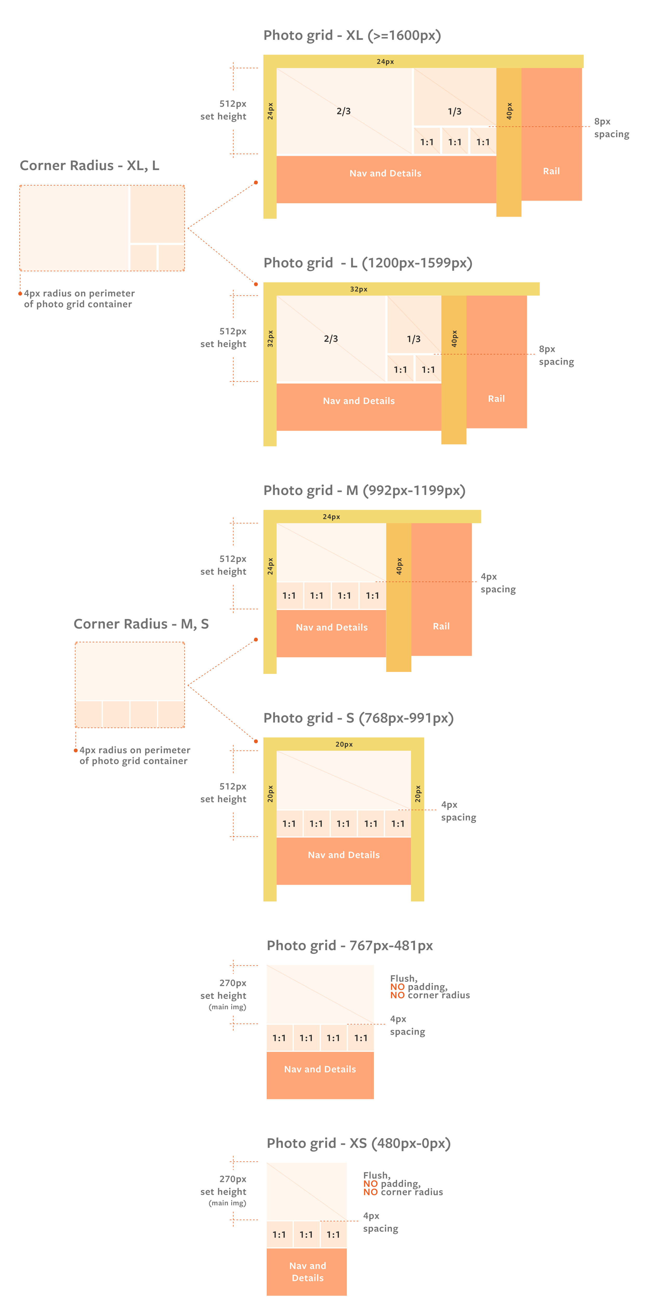
Documentation for breakpoints
After finalizing the photo layout for desktop I worked closely with my UXE to determine the right structure for responsiveness. Together we carefully calculated the correct breakpoints and specs that were needed, maintaining the correct aspect ratios within each breakpoint range. I then created documentation specs to help the engineers better understand the calculations behind sizing requirements at handoff.
Final touches
One of the final decisions we made was adding in a hover affordance for each photo in the grid. As the user hovers over a photo the corner radius increases slightly (shown in the video to the right).
Findings & future improvements
Early metrics saw user engagement increase by an average of 50%, in addition to more users scrolling within the page. When the test was called a few weeks later, the photo grid was then rolled out to 100% across Desktop and mWeb. Because of the increased engagement with the photo grid component, future improvements would involve rolling it out to native and improving the subsequent photo gallery experience. Another future improvement could be educating the property owners, and guiding them to place images best suited for the detail page.
The success of the photo grid redesign was a part of many improvements the team is working on to enhance the experience within the detail page as a whole.


